DateInput
- Guide
- _DateInput.cshtml
The _DateInput.cshtml is a reusable Razor partial view component that creates a styled date input field with calendar popup functionality. It supports both Ummalqura (Hijri) and Gregorian calendar systems.
UI Preview
| State | Preview |
|---|---|
| Gregorian | 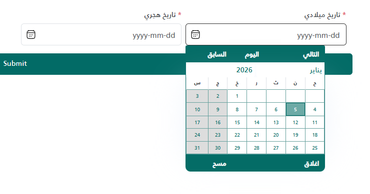 |
| Hijri | 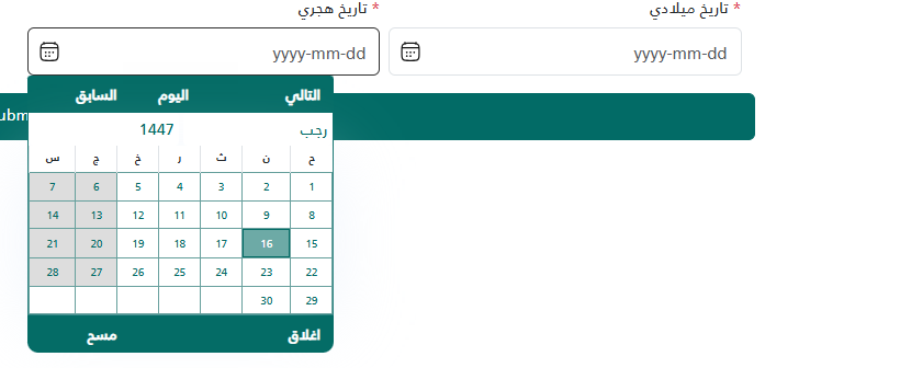 |
Component Features
- ✅ Calendar popup with date selection
- ✅ Support for Ummalqura (Hijri) and Gregorian calendars
- ✅ Required field validation
- ✅ Custom SVG calendar icon
- ✅ Modal-compatible (auto-reinitializes in modals)
- ✅ Responsive Bootstrap styling
Model Parameters
The component accepts a tuple with the following parameters:
| Parameter | Type | Required | Description |
|---|---|---|---|
Label | string | Yes | The label text displayed above the input |
Required | bool | Yes | Whether the field is required (shows red asterisk) |
Id | string | Yes | Unique ID for the input element |
Placeholder | string | Yes | Placeholder text shown when empty |
DateType | string | No | Calendar type: "ummalqura" (default) or "gregorian" |
Usage Examples
Basic Usage (Ummalqura Calendar)
@await Html.PartialAsync("_DateInput", new {
    "تاريخ الميلاد",  // Label
    true,             // Required
    "BirthDate",      // Id
    "اختر التاريخ"    // Placeholder
})
With Gregorian Calendar
@await Html.PartialAsync("_DateInput", new
{
    "تاريخ التسجيل",  // Label
    true,             // Required
    "RegistrationDate", // Id
    "Select Date",    // Placeholder
    "gregorian"       // DateType
})
Optional Field (Not Required)
@await Html.PartialAsync("_DateInput", new
{
    "تاريخ الإنهاء",  // Label
    false,            // Required (false = optional)
    "EndDate",        // Id
    "اختر التاريخ"    // Placeholder
})
Integration Notes
Required JavaScript Functions
This component depends on the createCalendersWithRang function which should be available globally:
function createCalendersWithRang(selector, minRange, maxRange, dateType, rangeString)
Parameters:
selector: CSS selector for the input elementminRange: Minimum date range (e.g.,"-100y"for 100 years back)maxRange: Maximum date range (e.g.,"+2y"for 2 years forward)dateType: Calendar type (""for Gregorian,"ummalqura"for Hijri)rangeString: Range string for validation
Modal Support
The component automatically reinitializes when used inside Bootstrap modals. No additional code is required.
Form Validation
When Required is set to true:
- A red asterisk (*) appears next to the label
- The input has the
requiredattribute - An error message appears below the input if validation fails
CSS Classes Used
form-control- Bootstrap input stylingform-label- Bootstrap label stylingtext-danger- Red text for required indicator/errorsmall- Small text size for error messages
@using System.Runtime.CompilerServices
@model dynamic
@{
var tuple = (ITuple)Model;
var Label = tuple[0].ToString();
var Required = (bool)tuple[1];
var Id = tuple[2].ToString();
var Placeholder = tuple[3].ToString();
var DateType = tuple.Length > 4 ? tuple[4]?.ToString() : "ummalqura";
if (string.IsNullOrEmpty(DateType))
{
DateType = "ummalqura";
}
}
<style>
	.calendars-popup {
		z-index: 1061 !important;
		position: absolute;
	}
</style>


<div class="mb-3">
	<label for="@Id" class="form-label">
		@if (Required)
		{
		<span class="text-danger">*</span>
		}
		@Label
	</label>
	<div class="position-relative">
		<input type="text" class="form-control" id="@Id" name="@Id" placeholder="@Placeholder" readonly="readonly"
			@(Required ? "required" : "" ) style="padding-left: 35px;">
		<svg style="position: absolute; left: 10px; top: 50%; transform: translateY(-50%); pointer-events: none;" width="20"
			height="20" viewBox="0 0 20 20" fill="none" xmlns="http://www.w3.org/2000/svg">
			<path
				d="M6.66536 9.99935C6.20513 9.99935 5.83203 10.3724 5.83203 10.8327C5.83203 11.2929 6.20513 11.666 6.66536 11.666H6.67284C7.13308 11.666 7.50618 11.2929 7.50618 10.8327C7.50618 10.3724 7.13308 9.99935 6.67284 9.99935H6.66536Z"
				fill="#161616" />
			<path
				d="M9.99496 9.99935C9.53472 9.99935 9.16163 10.3724 9.16163 10.8327C9.16163 11.2929 9.53472 11.666 9.99496 11.666H10.0024C10.4627 11.666 10.8358 11.2929 10.8358 10.8327C10.8358 10.3724 10.4627 9.99935 10.0024 9.99935H9.99496Z"
				fill="#161616" />
			<path
				d="M13.3246 9.99935C12.8643 9.99935 12.4912 10.3724 12.4912 10.8327C12.4912 11.2929 12.8643 11.666 13.3246 11.666H13.332C13.7923 11.666 14.1654 11.2929 14.1654 10.8327C14.1654 10.3724 13.7923 9.99935 13.332 9.99935H13.3246Z"
				fill="#161616" />
			<path
				d="M6.66536 13.3327C6.20513 13.3327 5.83203 13.7058 5.83203 14.166C5.83203 14.6263 6.20513 14.9993 6.66536 14.9993H6.67284C7.13308 14.9993 7.50618 14.6263 7.50618 14.166C7.50618 13.7058 7.13308 13.3327 6.67284 13.3327H6.66536Z"
				fill="#161616" />
			<path
				d="M9.99496 13.3327C9.53472 13.3327 9.16163 13.7058 9.16163 14.166C9.16163 14.6263 9.53472 14.9993 9.99496 14.9993H10.0024C10.4627 14.9993 10.8358 14.6263 10.8358 14.166C10.8358 13.7058 10.4627 13.3327 10.0024 13.3327H9.99496Z"
				fill="#161616" />
			<path fill-rule="evenodd" clip-rule="evenodd"
				d="M5.6237 1.66602C5.6237 1.32084 5.34388 1.04102 4.9987 1.04102C4.65352 1.04102 4.3737 1.32084 4.3737 1.66602V2.19501C3.70307 2.38508 3.13745 2.69401 2.66665 3.20298C2.01839 3.9038 1.73024 4.78928 1.59224 5.89894C1.45702 6.98627 1.45702 8.37974 1.45703 10.1577V10.6743C1.45702 12.4523 1.45702 13.8458 1.59224 14.9331C1.73024 16.0427 2.01839 16.9282 2.66665 17.629C3.32132 18.3368 4.15933 18.6577 5.2081 18.8102C6.22313 18.9577 7.51999 18.9577 9.1564 18.9577H10.841C12.4774 18.9577 13.7743 18.9577 14.7893 18.8102C15.8381 18.6577 16.6761 18.3368 17.3307 17.629C17.979 16.9282 18.2672 16.0427 18.4052 14.9331C18.5404 13.8458 18.5404 12.4523 18.5404 10.6743V10.1577C18.5404 8.37975 18.5404 6.98627 18.4052 5.89894C18.2672 4.78928 17.979 3.9038 17.3307 3.20298C16.8599 2.69401 16.2943 2.38508 15.6237 2.19501V1.66602C15.6237 1.32084 15.3439 1.04102 14.9987 1.04102C14.6535 1.04102 14.3737 1.32084 14.3737 1.66602V1.97093C13.427 1.87432 12.262 1.87434 10.841 1.87435H9.1564C7.73538 1.87434 6.57042 1.87432 5.6237 1.97093V1.66602ZM4.39753 3.50422C4.47208 3.766 4.71301 3.95768 4.9987 3.95768C5.34388 3.95768 5.6237 3.67786 5.6237 3.33268V3.22817C6.50787 3.12565 7.65067 3.12435 9.20703 3.12435H10.7904C12.3467 3.12435 13.4895 3.12565 14.3737 3.22817V3.33268C14.3737 3.67786 14.6535 3.95768 14.9987 3.95768C15.2844 3.95768 15.5253 3.766 15.5999 3.50422C15.9393 3.63928 16.197 3.81815 16.4131 4.05179C16.8074 4.47801 17.0408 5.06258 17.1639 6.04632C17.1371 6.04282 17.1098 6.04102 17.082 6.04102H2.91536C2.88763 6.04102 2.86032 6.04282 2.83354 6.04632C2.95663 5.06258 3.19002 4.47801 3.58428 4.05179C3.80039 3.81815 4.05811 3.63927 4.39753 3.50422ZM2.74047 7.26622C2.7075 8.06864 2.70703 9.02963 2.70703 10.2021V10.63C2.70703 12.4619 2.70817 13.7776 2.83268 14.7788C2.95554 15.7667 3.1891 16.353 3.58428 16.7802C3.97304 17.2005 4.49643 17.4436 5.3879 17.5732C6.30266 17.7061 7.50859 17.7077 9.20703 17.7077H10.7904C12.4888 17.7077 13.6947 17.7061 14.6095 17.5732C15.501 17.4436 16.0244 17.2005 16.4131 16.7802C16.8083 16.353 17.0419 15.7667 17.1647 14.7788C17.2892 13.7776 17.2904 12.4619 17.2904 10.63V10.2021C17.2904 9.02963 17.2899 8.06864 17.2569 7.26622C17.2014 7.28236 17.1427 7.29102 17.082 7.29102H2.91536C2.85466 7.29102 2.79597 7.28236 2.74047 7.26622Z"
				fill="#161616" />
		</svg>
	</div>
	@if (Required)
	{
	<div class="text-danger small mt-1" id="@Id-error" style="display: none;">الحقل مطلوب</div>
	}
</div>

<script>
	(function () {
		function initDateInput() {
			var $el = $("#@Id");

			// Remove daterangepicker if it was attached by global scripts
			if ($el.data('daterangepicker')) {
				$el.data('daterangepicker').remove();
				$el.off('.daterangepicker');
			}

			if (typeof createCalendersWithRang === 'function') {
				var dateType = '@(DateType == "gregorian" ? "" : DateType)';
				createCalendersWithRang("#@Id", "-100y", "+2y", dateType, "-100:+2");
			}
		}

		$(document).ready(function () {
			setTimeout(initDateInput, 100);
		});

		// If this element is inside a modal, we might need to re-initialize it when the modal is shown
		$(document).on('shown.bs.modal', function (e) {
			if ($(e.target).find("#@Id").length > 0) {
				setTimeout(initDateInput, 100);
			}
		});
	})();
</script>