Banner
- Guide
- _Banner.cshtml
The Banner component is used to display important information or notifications with an optional icon and title in a stylized container.
UI Preview
| State | Preview |
|---|---|
| Default | 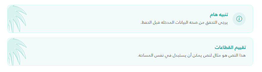 |
Usage
To use the banner, include the partial view in your page and provide the required model properties using a C# Tuple.
Basic Example
<partial name="UI/_Banner" model='(Icon: "bi-info-circle", Title: "Notice", Content: "This is a banner message.", TitleColor: null, IsSmall: false)' />
Advanced Example (with Raw HTML Icon)
<partial name="UI/_Banner" model='(
    Icon: "<img src=\"~/assets/images/custom-icon.svg\" />",
    Title: "System Update",
    Content: "The system will undergo maintenance at midnight.",
    TitleColor: "#d9534f",
    IsSmall: true
)' />

or

@await Html.PartialAsync("UI/_Banner", (
    Icon: "",
    Title: "تقييم القطاعات",
    Content: "هذا النص هو مثال لنص يمكن أن يستبدل في نفس المساحة.",
    TitleColor: "#00A79E",
    IsSmall: false
))
Properties
| Property Name | Type | Description | Default Value |
|---|---|---|---|
Icon | string? | The icon to display. Supports Bootstrap Icon classes (e.g., bi-gear) or raw HTML (e.g., <img> or <svg>). If raw HTML contains ~/, it will be automatically resolved to the root path. | null (No icon shown) |
Title | string | The bold heading text displayed at the top of the banner. | null / Empty (Row hidden if empty) |
Content | string | The main body text/description of the banner. | Required |
TitleColor | string? | A custom hex color code for the title and primary icon. | "#1F2937" |
IsSmall | bool | If set to true, applies a small utility class to the content text. | false |
Visual Features
- Background: Soft teal background (
#00A79D0D) with a matching border. - Decorative Element: Includes a palm tree background image (
palm.svg) positioned on the left side of the banner. - Icon Styling: Icons are automatically wrapped in a circular teal background.
- Responsive: Flex-based layout that aligns items centrally with a gap.
Dependencies
- Bootstrap Icons: Required for class-based icons (e.g.,
bi-info-circle). - Bootstrap 5: Uses utility classes like
mb-3,d-flex,align-items-center,gap-3, andfw-bold. - Assets: requires
~/assets/images/palm.svgfor the background decoration.
@model (string? Icon, string Title, string Content, string? TitleColor, bool IsSmall)

@{
var titleColor = !string.IsNullOrWhiteSpace(Model.TitleColor) ? Model.TitleColor : "#1F2937";
var contentClass = Model.IsSmall ? "small" : "";
}

<style>
	.info-banner {
		background: #00A79D0D;
		border: 1px solid #CCFBF1;
		border-radius: 12px;
		padding: 1.5rem;
		position: relative;
		overflow: hidden;
		display: flex;
		align-items: center;
		justify-content: space-between;
		color: var(--banner-title-color, #1F2937);
	}

	.info-banner h6 {
		color: var(--banner-title-color, #1F2937) !important;
	}

	.palm-bg {
		position: absolute;
		left: 0;
		height: 100%;
		pointer-events: none;
	}

	.banner-icon-wrapper {
		width: 44px;
		height: 44px;
		background: #E0F2F1;
		border-radius: 50%;
		display: flex;
		align-items: center;
		justify-content: center;
		color: #00A79D;
		font-size: 1.2rem;
		position: relative;
		z-index: 1;
	}

	.banner-icon-wrapper img {
		width: 24px;
		height: 24px;
		object-fit: contain;
	}

	.banner-content-wrapper {
		position: relative;
		z-index: 1;
	}

	.info-banner-content {
		font-weight: 500;
	}
</style>

<div class="info-banner mb-3" style="--banner-title-color: @titleColor;">
	<img src="~/assets/images/palm.svg" class="palm-bg" />
	<div class="d-flex align-items-center gap-3">
		@if (!string.IsNullOrEmpty(Model.Icon))
		{
		<div class="banner-icon-wrapper">
			@if (Model.Icon.Trim().StartsWith("<")) { var iconHtml=Model.Icon; if (iconHtml.Contains("~/")) {
				iconHtml=iconHtml.Replace("~/", Url.Content("~/")); } @Html.Raw(iconHtml) } else { <i class="bi @Model.Icon">
				</i>
				}
		</div>
		}
		<div class="banner-content-wrapper">
			@if (!string.IsNullOrEmpty(Model.Title))
			{
			<h6 class="fw-bold mb-1">@Model.Title</h6>
			}
			<div class="info-banner-content text-muted @contentClass">@Model.Content</div>
		</div>
	</div>
</div>